
VISUAL COMMUNICATIONS


ON-IT REGIONAL TRANSIT - SUMMER CAMPAIGN 2025
For the Summer 2025 campaign, I led the visual design for a multi-format out-of-home and print campaign for On‑It Regional Transit, aimed at increasing awareness and ridership for travel between Calgary and Banff. The campaign centred on a high-impact billboard positioned along Highway 1 to Banff, strategically targeting peak summer traffic. In addition, I designed digital billboard creatives displayed both outside and inside YYC Calgary International Airport, reaching local travellers and incoming tourists at key decision points. To support on-the-ground visibility, I also created rack cards distributed across hotels throughout Calgary, ensuring consistent messaging across visitor touchpoints. The project required adapting a cohesive visual concept across large-scale outdoor, digital, and print formats—balancing clarity, brand alignment, and legibility while capturing the excitement of summer travel in the Rockies.


STANDARD BUS YUKON X AIR NORTH YUKON'S AIRLINES - MOTORCOACH DECALS COLLABORATION 2025
I developed a blueprint-style bus wrap concept for Standard Bus Yukon, created in collaboration with Air North Yukon’s Airlines. The initiative aimed to transform a motorcoach into a moving visual metaphor of an aircraft—bridging ground and air travel through bold, imaginative design. My initial concepts explored two creative directions: one showcasing the iconic landscapes of the Yukon, and another depicting an aircraft soaring above the clouds to evoke the feeling of flight. Building on these ideas, I worked closely with Air North’s internal graphic designer to refine the final execution, which featured the airline’s aircraft imagery set against a clear blue sky—seamlessly blending both brands’ identities. The final bus wrap was enthusiastically received by stakeholders from both organisations and was ultimately published in Yukon news outlets, highlighting the project as a successful example of cross-brand collaboration and large-scale environmental design.


EMPLOYEE HANDBOOK 2025-2026
I led the end-to-end design and production of a nationwide Employee Handbook for school bus drivers, distributed coast to coast with thousands of printed copies produced and shipped across multiple cities and provinces.
The project involved designing the handbook both internally and externally, including the full visual system, layout structure, and print-ready files. Working from content provided by the Safety Department, I translated complex operational and safety messaging into a clear, accessible, and driver-friendly layout, ensuring consistency, readability, and compliance throughout.
I collaborated closely with major stakeholders across departments, managing multiple rounds of feedback while navigating a high-pressure, time-sensitive turnaround. Despite delays from external dependencies, I dedicated additional working hours to keep the project on track, ultimately meeting the deadline and coordinating successful print production and drop-shipping nationwide.
This project demonstrates my ability to manage large-scale corporate communications, align cross-functional teams, and deliver critical materials under tight timelines without compromising quality.

CLIENT BOOK PROJECT 2022
I had the privilege to collaborate on a significant book design project, encompassing both the hardcover artwork and the complete interior layout. This endeavor was in partnership with a Calgary-based author, tailored to resonate with middle-aged and senior readers seeking guidance as they approach life's final chapters. Despite numerous revisions, the dedication invested bore fruit. The project's central focus was on enhancing reading comprehension, ensuring a seamless and engaging experience for readers. The professional rewards were profound, and the journey left an indelible mark on my career. Beyond the creative fulfillment, witnessing the global reach of our work, as the book found its way into the hands of readers worldwide, added a truly unforgettable dimension to this project.


ALISON EDUCATION GROUP BRANDING
Welcome to a showcase of logos and branding that have been meticulously designed to encapsulate the essence of the educational institutions within the Alison Education Group. Each logo is more than just an image; it's a visual embodiment of the unique identity and aspirations of the colleges it represents. With a deep understanding of the values, culture, and academic offerings of each institution, I embarked on a creative journey to craft logos that resonate with students, faculty, and the community at large. Conceptually, these logos serve as the face of education, embodying knowledge, growth, and the pursuit of excellence.


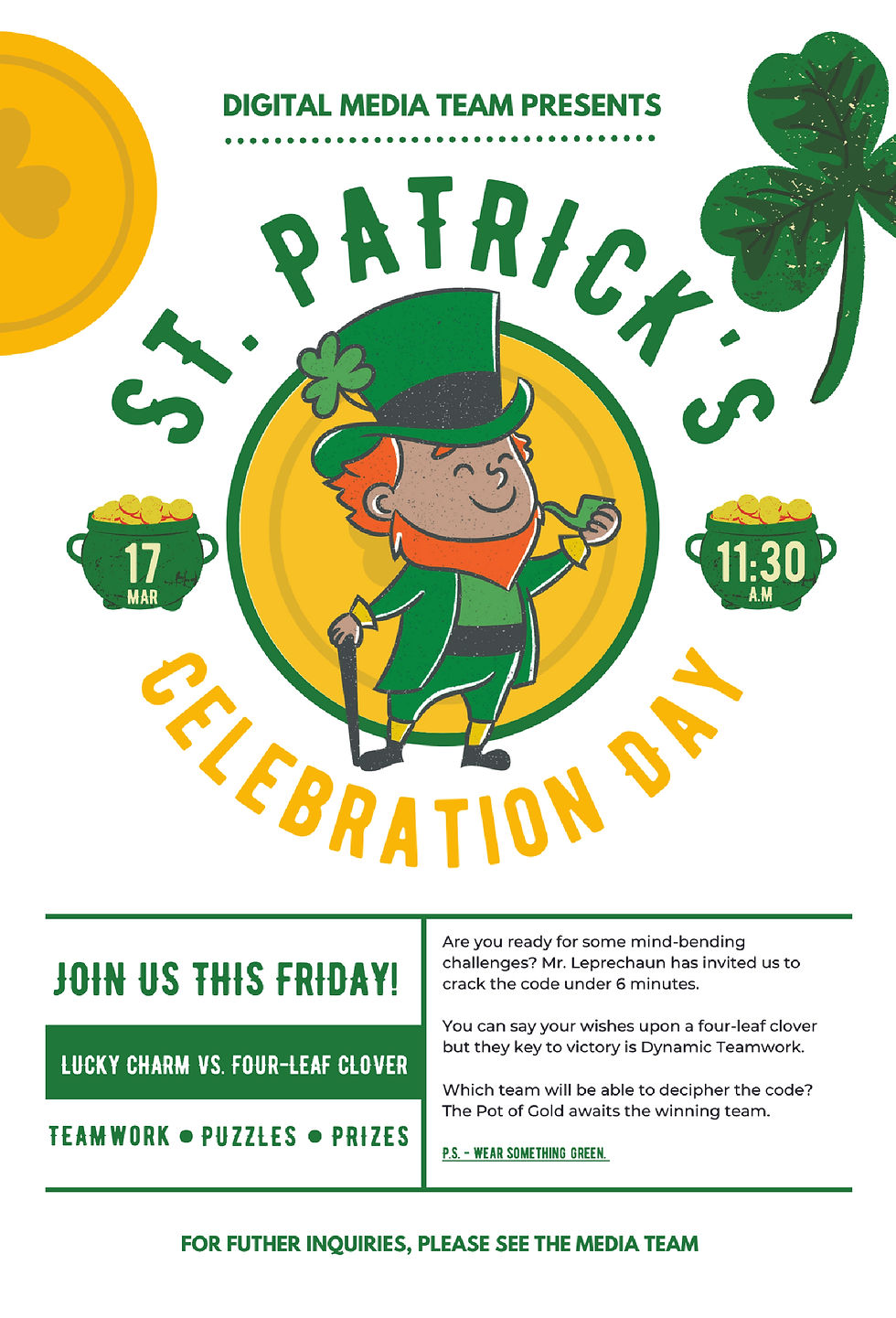
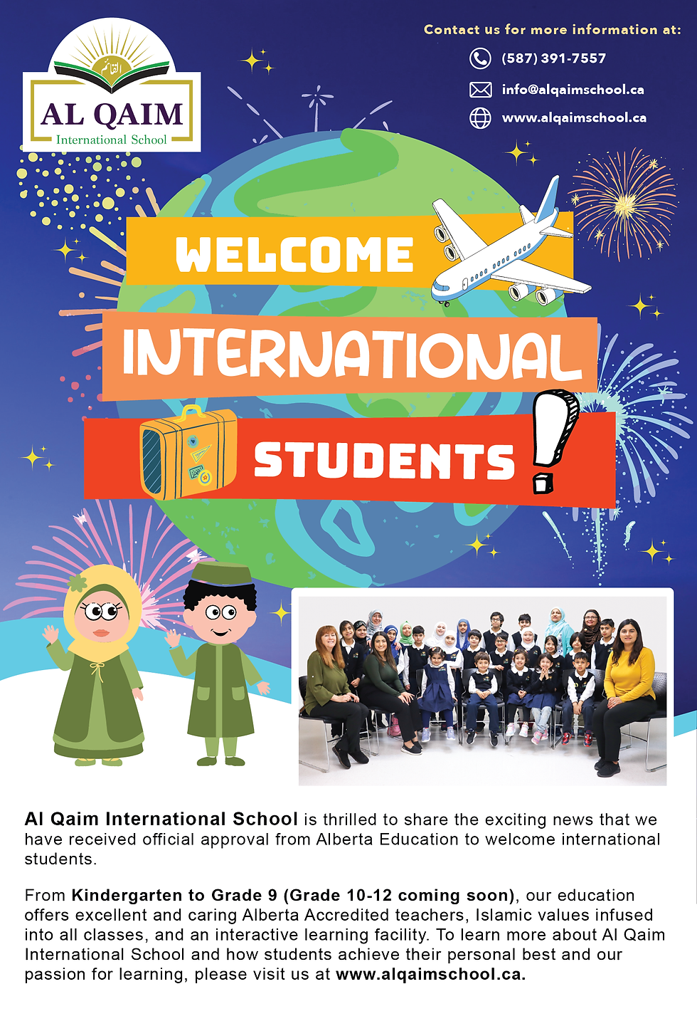
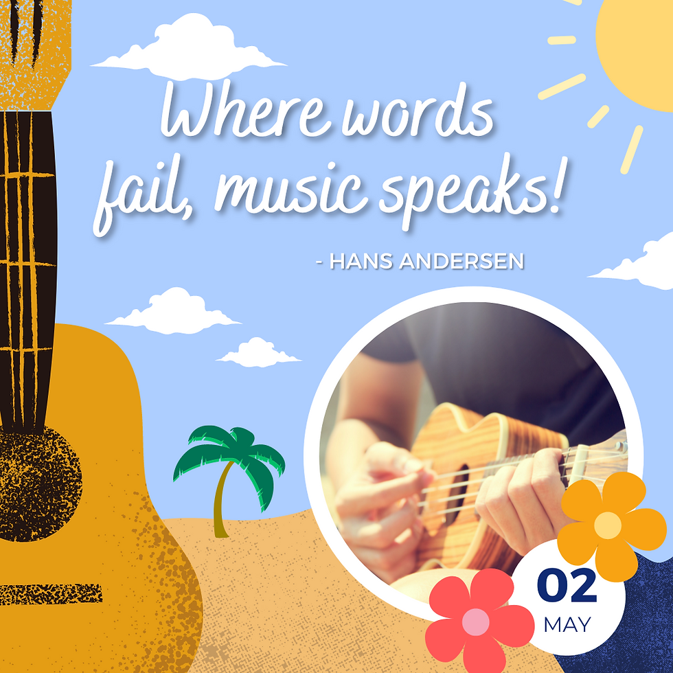
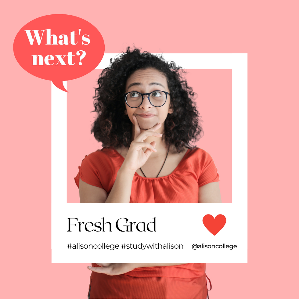
SOCIAL MEDIA POSTS


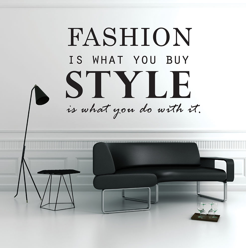
TYPOGRAPHY
Typography is more than just arranging letters; it's about crafting an experience, setting a mood, and conveying meaning through the subtle interplay of shapes, sizes, and styles. Presenting my typography creations for two distinct ventures: Normandeau, a premier company specializing in exquisite blinds, shades, shutters, curtains, and drapery – the essential elements for crafting harmonious home interiors that enhance any room or entire living spaces; and Apple Fitness, dedicated providers of top-tier fitness equipment.


SCOOBY DOO & THE CREW | VECTOR ILLUSTRATION
Airing from 1969 to 1991, Scooby-Doo is still one of the longest-running cartoons in TV history and the highest-rated Saturday morning television show of all time. As a huge fan of Scooby-Doo since 1996, I made a vector art to show my appreciation of their classic storyline that every meddling kid (or kid at heart) enjoys as they celebrate their 50th Anniversary.
